10 Tips for Effective UI/UX Design Presentation
- Tips & Tricks,
- 6 minutes to read
If you’ve ever had to sit through a course where the lecturer drones on and on, you would understand just how easy it is to lose concentration and zone off.
Imagine if the class was filled with catchy illustrations and storytelling designed to keep your attention glued to the matter at hand. Sounds much better right? It’s the same with UI/UX design, a clear and easy-to-understand presentation conveys your message across whilst keeping the interest of the audience peaked and ready for more. It is up to you to explain your wild and eccentric thoughts in a way your listeners can understand, how else would they be part of your journey. Today we would talk about certain tips that can help you assemble a more effective UI/UX design presentation.
What is UI/UX design presentation?
Before we proceed you need to understand what UI/UX presentation is. A key factor that determines our success in the design industry is our ability to convince stakeholders and board members to invest in our ideas and vision. How do we pass along this message in a clear and understandable medium for the individual who has no idea how your field functions? With a presentation. This entails the process of compiling and breaking down ideas in a visual and audio medium that is easy to understand for the sole purpose of educating our target audience. Without further ado let’s look at tips that would help you deliver an effective presentation.
1. Understand the aim of the presentation
Before embarking on a journey it is only natural you have a destination in mind. More so with any UI/UX design presentation, you should always have a clear mental picture of the results you want. What are the problems you aim to solve? What is the solution? These and more are questions you should have answers to.
Illustration by Dmitry Nikulnikov from Ouch!
2. Understand your listeners
If you’re pitching a virtual gym buddy to stakeholders who have a strong interest in the fitness community, it is only sensible you tailor your presentation to include subjects relevant to them. For example; Jokes and stories they can relate to that will capture and hold their attention, Illustrations and pictures in your presentation should be related to the fitness world. Research thoroughly about your audience and tailor your content accordingly.
3. Be conscious about your time management
You should be able to communicate your ideas in short, easy-to-understand bursts. Don’t spend 5 minutes on a topic that can be done in 2. That’s 3 minutes where you can potentially lose the attention of your audience, no one wants to listen to you drone on and on. A little break in between(if it's a lengthy presentation) isn't a bad idea, now is the perfect time to tell a story or joke before heading back in.
4. A good story helps
Stories provide refreshing comic reliefs and help to keep the creative part of the brain active. It helps if the stories relate to the subject at hand, they should all come together to pass your message across in a witty and knowledgable manner. That way It starts to feel like an interesting conversation instead of a lecture.
Illustration by Icons 8 from Ouch!
5. Visual images are your friend
There’s a reason bedtime stories are chucked full of illustrations and pictures. They convey information in an engaging and direct manner. Your presentation should be able to keep the audience engaged while educating them thoroughly on the subject at hand. You can also provide a reference page explaining terms/words individuals from other fields might not be conversant with. It would help ensure everyone moves together. You can use icons from Flaticon to make your audience understand the concepts you’re presenting faster. Use them to illustrate points and show examples of what you’re talking about.
6. Use design aids to reduce your workload
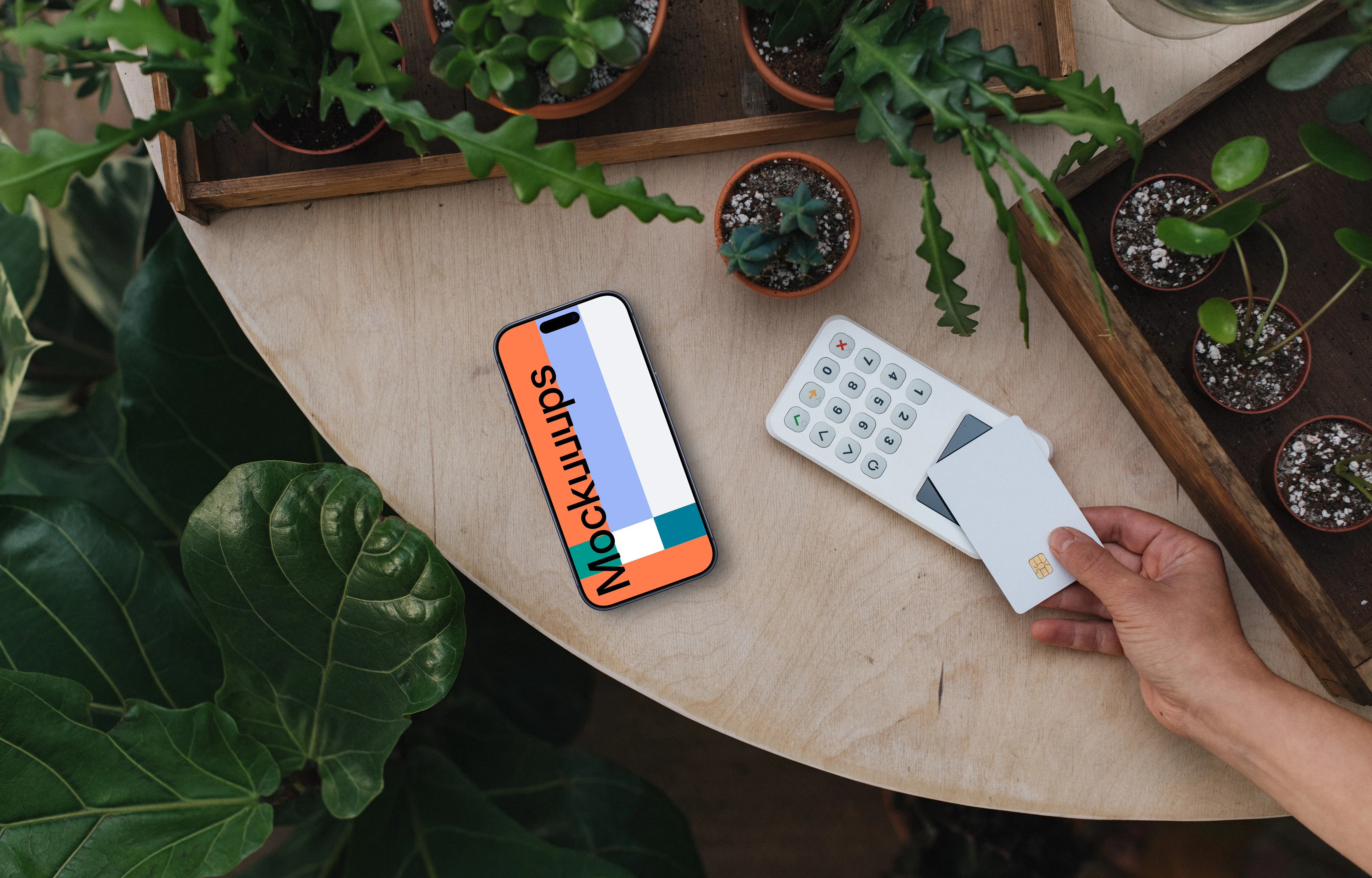
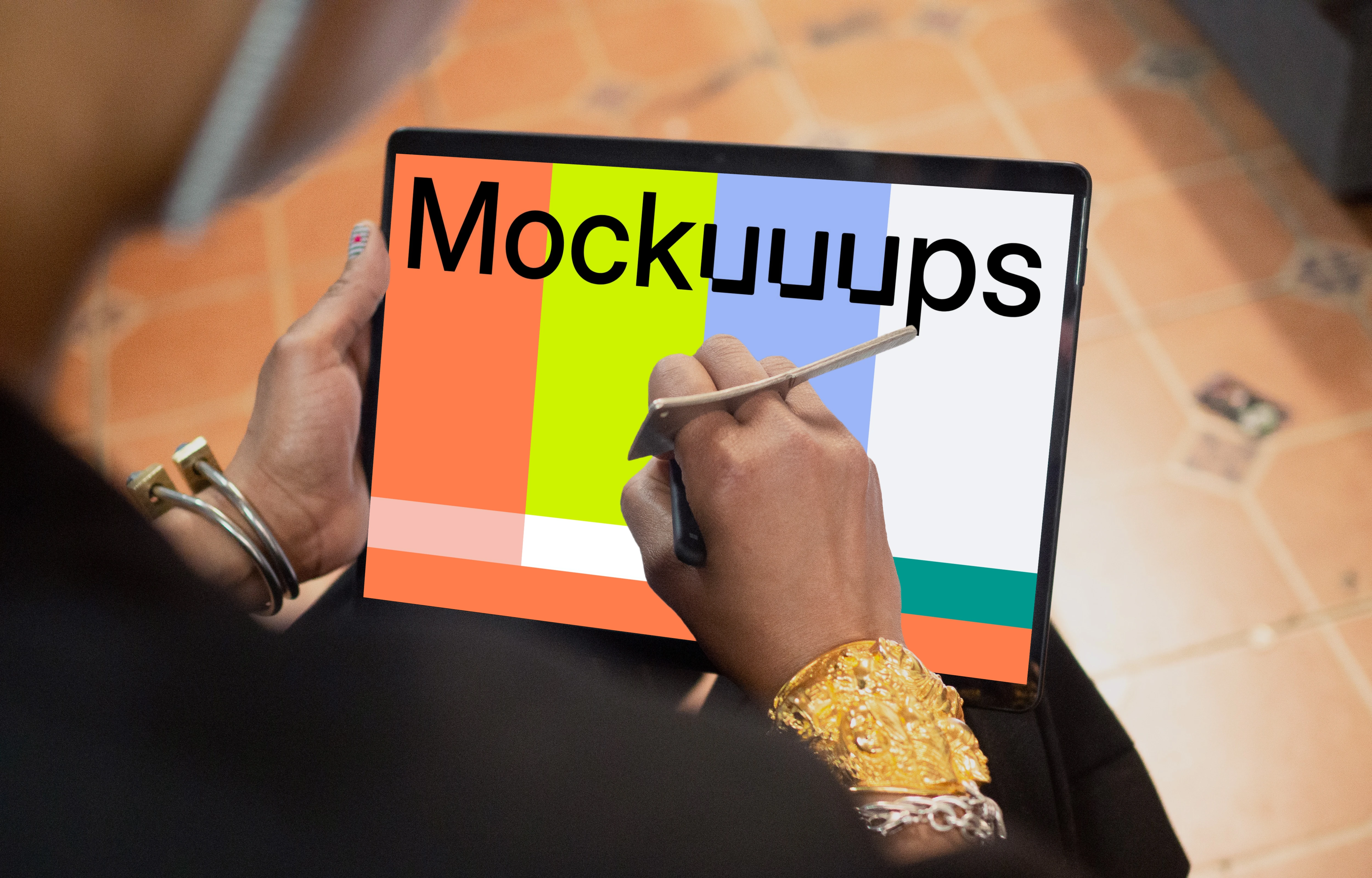
A good aid to help reduce the stress involved in designing your presentation from scratch is the use of a mockup generator. Whether it’s a web application or mobile app, it makes your work look presentable when you go the extra mile by adding mobile and laptop frames as needed.
Illustration by Icons 8 from Ouch!
7. Practice, practice and practise.
You don’t want to be tongue-tied when it’s your moment of redemption, the only thing that can give you that confidence boost you need is the assurance you’re 100% prepared. You can enlist a friend to help you organize a mock presentation, rehearse your lines and address potential questions that might be asked. This would help boost your confidence.
8. Proper use of white space
When words and pictures are clustered together it can be quite disorienting, ensure you have implemented proper use of white space in your presentation. There is no point in trying to shorten the slides used if it affects how well your audience is able to process and understand the message at hand. Ensure your work is aesthetically pleasing to the eyes, your font size is readable and bold( now is not the time to use an eccentric font, practicality would make more sense).
9. Proper use of subject hierarchy
The main points should have the largest font, it helps when a quick glance at a key point is able to explain what the subject matter is about. Side notes with lower fonts tend to be glazed over, so an all-encompassing subject heading increases the overall understanding of the matter at hand.
10. Trust in your ability
Over the course of your presentation, you would be asked difficult questions meant to take you off balance, it is your job to be unshakeable and calm. Trust in your ability and preparations, don’t be flustered, you’ve gone over the prospective questions at home, all you have to do is believe in yourself, speak clearly and show how confident you’re. Your employers/partners would pick up on that vibe and respect how composed you’re.
Illustration by Victoria Chepkasova from Ouch!
The power of mockup generator
Mockup generators are a designer’s best friend. A mockup generator will give you the power to show your audience how the product will look without a prototype. Using a mockup generator should be a top consideration when preparing for a UI/UX design presentation. Let the audience have a clear image of the product to be developed by showing them mockups of every component.
With all being said, it is time for action. Whether it is a designer or a marker, UI/UX design presentations should be more about the visualization of the actual product. Mockuuups Studio is a premier mockup generator that offers cutting-edge product designs customizable to fit any given design. Mockuuups Studio has a variety of over 800 scenes for generating mockups that look like the actual product. There is no need to scratch your head on getting a mockup that works for your UX/UI design presentation; Mockuuups Studio has it all! Head over to Mockuuups.studio and choose a readymade mockup that suits your need or create one in just a few clicks.
