![30 Best Modern Fonts for Web and Apps [2025]](https://assets.mockuuups.com/mo/image/upload/w_0.5/vnm78po3diatsbcfdipk)
Sometimes, you need a font to use in a design or project. The process of choosing and finding the right one can be overwhelming. With so many different typefaces out there, the choice can be difficult. In this article we'll look at 30 best fonts that are perfect for web and apps design projects. If you’re specifically looking for typefaces that make your brand stand out, check out our designer’s guide to fonts that feel like logos—it’s packed with logo-ready options and expert tips. We'll also discuss some things to consider before using free fonts and how to organise them once you’ve downloaded them onto your computer.
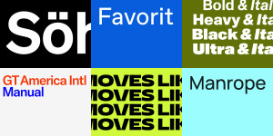
1. Clash Grotesk
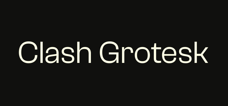
Clash Grotesk is a family of sans-serif fonts with a unique twist. Its six styles are inspired by the neo-grotesk genre, but with one distinct feature: the letterforms have small 'apertures', or openings at the edges of the counterforms. This gives the font an eye-catching, almost closed shut look, making it suitable for both corporate and editorial design. The font family includes a range of weights from Extralight to Bold and are optically monolinear in all styles. It's optimized for use at running-text sizes, making it one of the best fonts for apps.
2. General Sans Font
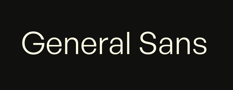
General Sans is a sans-serif typeface designed by Steve Matteson in 1998. It was designed to be a versatile and neutral typeface that could be used in many contexts. The font is available in regular, italic, bold, and bold italic weights.
This font has a tall x-height with open counters that make it legible from small sizes up to large ones on web pages and apps.
3. Lexend
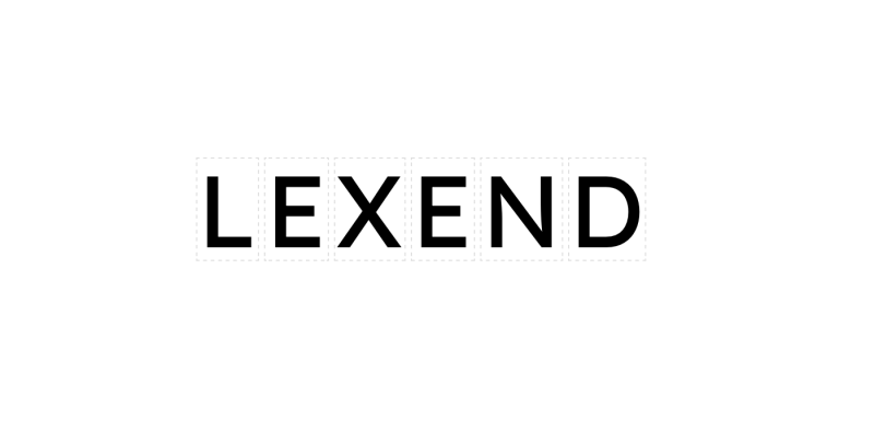
Lexend is a modern sans serif font family designed by the type foundry Fontfabric. It has a clean and minimalist design, with straight lines and high contrast between thick and thin strokes, which makes it perfect for web design.
The font comes in four weights—Light, Regular, Medium and Bold—including italics for all of them except Light. The typeface can be used for both personal and commercial projects, so you won’t have to pay anything to use this font in your designs or applications!
4. Arial
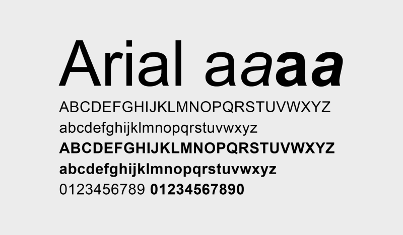
Arial is a sans-serif typeface developed by Monotype Imaging in 1982 as a copy of Helvetica, with similar proportions and weights. It was sold by Microsoft as part of the Windows 3.1 operating system, but has since been included as part of the core fonts for Windows 95 through Windows 10. Arial was created to be an imitation sans-serif Helvetica font family that would improve on some of its shortcomings (e.g., lowercase apertures) and provide an alternative for applications where Helvetica's high licensing fees made it cost-prohibitive or undesirable to use (such as on computer games).
5. Manrope
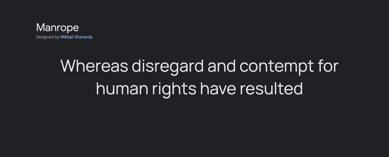
Manrope is considered one of the best fonts for apps, as it is an open-source modern sans-serif font family designed by Mikhail Sharanda in 2018. In 2019, Mirko Velimirovic collaborated with Sharanda to convert it into a variable font, making it even more versatile for app use.
6. Poppins
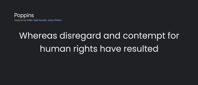
Poppins is a free geometric sans-serif typeface designed by Pablo Impallari. It’s one of my favorites, as it has a friendly, open character and works well in both display and text sizes. The Poppins font family comes in eight weights: Thin, Light, Regular, Medium, Bold, Black, Extra Black and Heavy (which extends the design into an additional condensed width).
The font is currently used on the website for Google’s Chrome browser so you can see how it looks in action there too!
7. Roboto
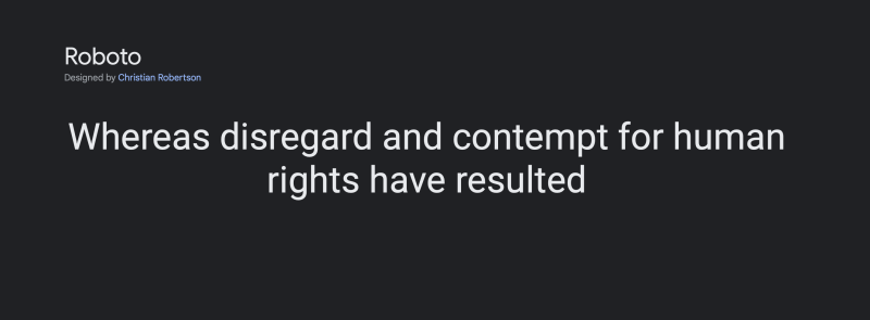
Roboto, a geometric sans-serif typeface family created by Google, stands out as one of the best fonts for Android. It is freely available on the web and has been the default system font for Android starting from version 4.4 "KitKat" in 2014.
This versatile font family includes both serif and sans-serif variations, catering to almost all Latin scripts, plus Greek and Cyrillic. Additionally, Roboto offers unique stencil and chalk styles, further enhancing its adaptability and making it an excellent choice for Android interfaces.
8. Montserrat
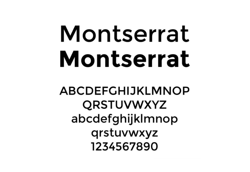
Montserrat is a geometric sans-serif typeface designed by Spanish type designer Juan Pablo del Peral and published by his company, Juan Pablo del Peral Publishing. It is available in three weights, regular, medium and bold.
It was developed as a part of a personal project while designing another typeface called Adelle. While experimenting with its design he created a hybrid between the Humanist sans-serifs such as Gill Sans or Futura and the Geometric ones like Avenir or Eurostile.
9. Nunito Sans
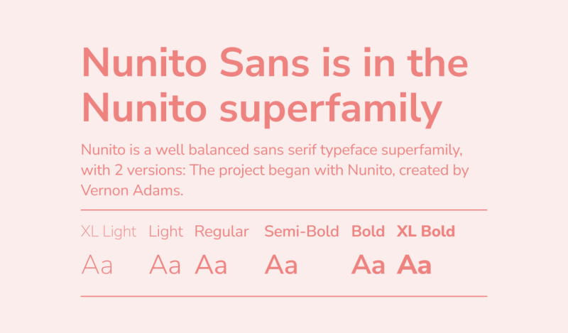
This font is free to use. It comes in OTF and TTF format, and it includes a variety of weights and styles. This typeface is best used for headlines, but it can also be used for body text as well. Great for both print or digital design, Nunito Sans works well on the web or apps too!
Nunito Sans is also available with serifs (Nunito Sans Serif) which makes it an even better option if you're looking for something that has some weight behind it visually speaking!
10. Proxima Nova
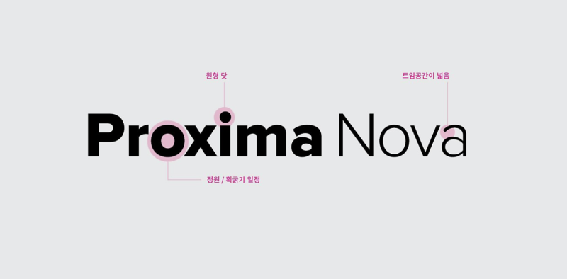
Proxima Nova has a distinctive appearance that makes it unique, but it's also similar to its sister font Proxima Sans. The family includes Regular, Light and Bold versions, with a matching Italic version for each. Each weight also includes small caps and old style figures.
You can use Proxima Nova on its own or as part of a combination of fonts (such as using different weights of the same typeface). As you might expect from its name, this font is designed to be used primarily in headlines and subheads; however, it can also be used as body text if you aren't concerned about readability issues.
11. Plus Jakarta Sans
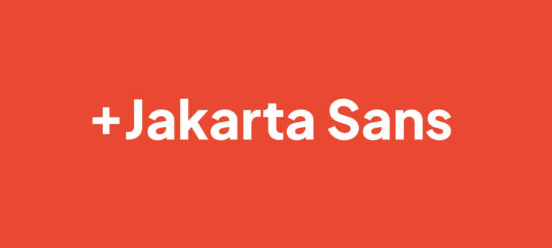
Plus Jakarta Sans is considered one of the best fonts for apps due to its contemporary sans-serif design and ability to remain legible at all sizes. It is a new generation of font designed for screen and print, making it perfect for apps. The optical size system used in Plus Jakarta Sans allows it to maintain its unique characteristics in large typographic compositions. The Plus Jakarta Sans family comes in a variety of weights and widths, including nine weights and four widths, and matching italics for each weight.
12. Satoshi
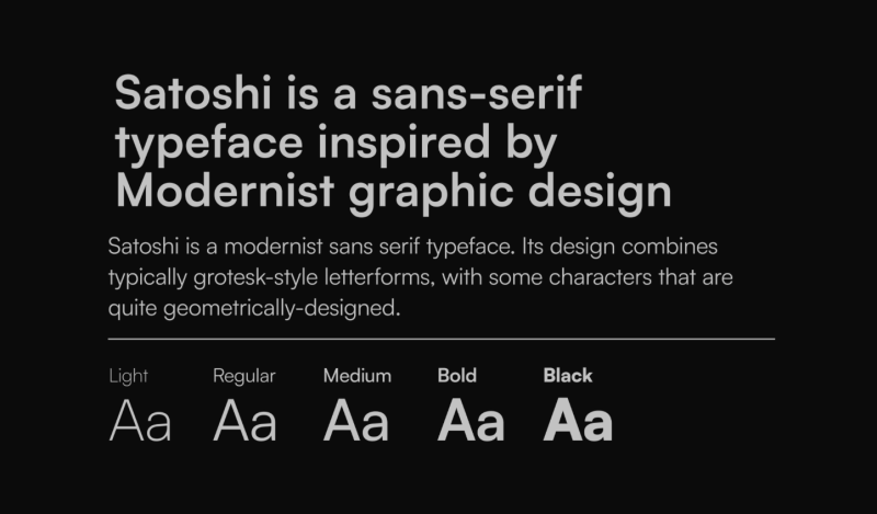
Satoshi is a free font family with a clean and legible design. It has an overall geometric appearance, with large x-height, open counters and rounded terminals.
The family includes light, regular and bold weights as well as italics for all weights except the bold one.
13. Lato
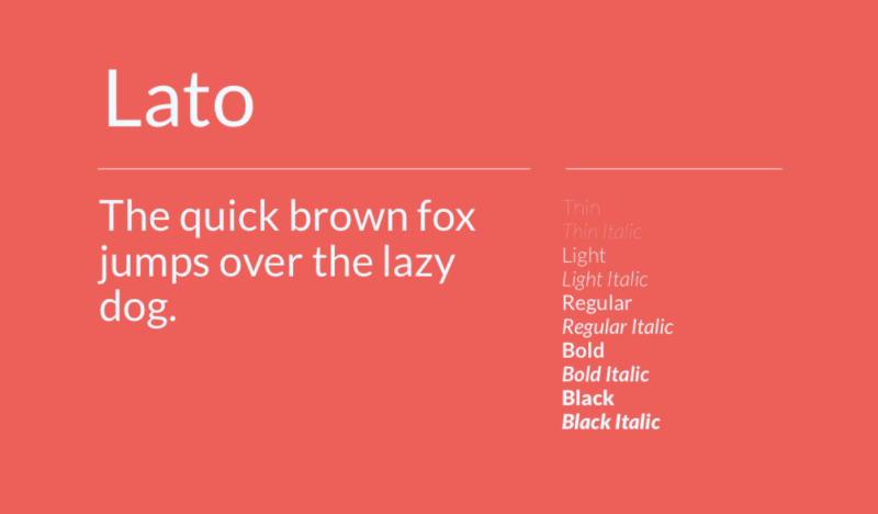
Lato is a sans-serif typeface family designed by Łukasz Dziedzic and distributed under the terms of the Open Font License. It is one of five families of fonts that make up Google’s Universal Design Language, which also includes Roboto, Noto Sans, Noto Serif and Cutive Mono. Lato started out as an open source project as part of Google Fonts in 2016 with its own site hosting it. Nowadays you can find it on Github or through various other sources.
14. Aileron
Aileron is a geometric sans serif typeface with a wide range of weights and styles. It was created in 2010 and released for public use in 2017 on Google Fonts, where it’s been downloaded more than 250 thousand times.
The free version of the font was originally available only as TTF files but now also comes with OTF files as well as web fonts that you can use on your website or app project without having to worry about licensing issues like copyright infringement or trademark violations.
15. Helvetica
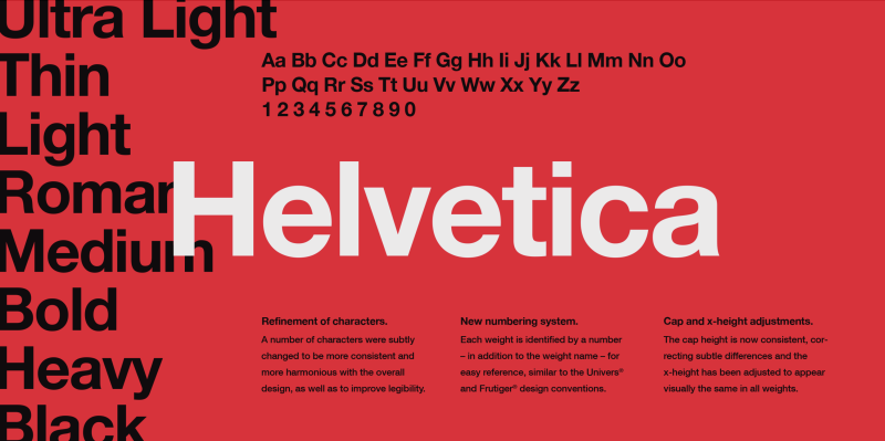
Helvetica is a sans-serif typeface designed in 1957 by Swiss typeface designer Max Miedinger with input from Eduard Hoffmann. It was released by the Haas Type Foundry of Münchenstein, Switzerland.
Helvetica is an all caps font, meaning that all letters are capitalized. This makes it easier to read on screen when used in headlines or other places where you want readers to see words clearly and quickly. Helvetica is popular because it was designed for clarity at small sizes, so you'll see it used everywhere from books to billboards.
16. Gilroy
The Gilroy Font Family, designed by Radomir Tinkov, is a modern sans serif with a geometric touch and an older brother of the Qanelas font family. It is available in 20 weights, including 10 uprights and their matching italics. The Light and Extra Bold weights are available for free use. Tinkov's generosity in sharing this free version allows for the opportunity to experience the versatility and beauty of this amazing set of fonts.
17. Inter
Inter is a geometric sans-serif typeface family. It’s available in 6 weights and has an italic version. The thin weight is bold enough for the headlines, medium weight is a great font for paragraphs and the bold weight can be used for subheadings. Inter looks great on big sizes as well as on smaller ones because of its clean design.
Inter is a great choice for branding, logos and poster design projects because it has some stylistic elements that give it character while still being very readable even at small point sizes
18. Avenir
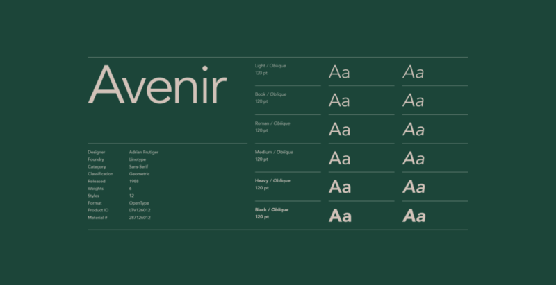
Avenir is a geometric sans-serif typeface designed by Adrian Frutiger. It was designed for the Paris Metro in 1984, and the typeface is used in both the printed and signage sectors.
The name Avenir means “future” in French, and its design is inspired by Futura. The font was later updated under the guidance of Kris Sowersby as part of his work at Monotype (known as Avenir Next). The unusual letterforms make it one of the most legible fonts out there for reading on screens or paper—so much so that Apple used it to make their iOS interface more readable than ever before!
19. Switzer
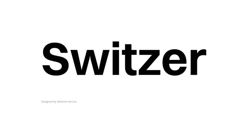
The Switzer font is a nostalgic, text-focused sans serif inspired by magazine ads from the 80s and 90s. It is a Latin-script typeface with 18 styles, including 9 italics, and has a neo-grotesk design. Despite resembling earlier typefaces, it is a fresh and timeless design, fitting for our current time. The neo-grotesk style, although not originating from Switzerland, is commonly associated with Swiss designers.
20. Work Sans
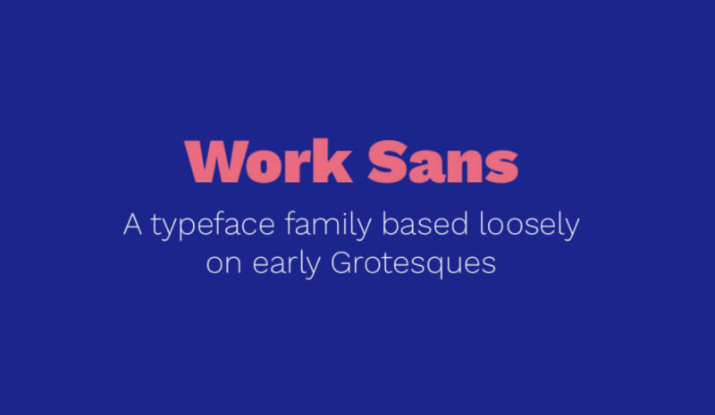
The font has been used by Google in all its logos since 2017, replacing Droid Serif as only one of two fonts used on their website at that time (the other being Roboto).
The name "Work Sans" is derived from its purpose—to serve as an efficient business face for use on websites and apps—and also from its status as a sequel or companion to another font with an existing meaning: the existing sans-serif serif family called "Work".
21. DM Sans
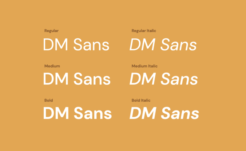
The DM Sans font, designed by Colophon Foundry, is a low-contrast geometric sans serif design created specifically for use in smaller text sizes. It's one of the best fonts for apps as it includes support for the Latin Extended glyph set, allowing for typesetting in English and other Western European languages. Colophon Foundry is a UK-based, international, and award-winning type foundry with locations in London and Los Angeles. The font was commissioned by Google and was based on the Latin portion of ITF Poppins by Jonny Pinhorn. Known for publishing and distributing high-quality retail and custom typefaces for both digital and analog media, Colophon Foundry ensures that DM Sans is optimized for app use.
22. Mona Sans
The Mona Sans typeface is a strong and versatile design, inspired by industrial-era grotesques and developed in collaboration with Degarism. It is suitable for use across various mediums including product design, web design, and print. The font pairs well with Mona Sans's companion font, Hubot Sans. Mona Sans is a variable font, which allows for multiple variations of the typeface to be included in one file. This format is supported by major browsers, resulting in improved performance and greater design control over the font's weight, width, and slant.
23. Huboti Sans
Hubot Sans is the companion font to Mona Sans, designed to complement it with its geometric accents and technical, idiosyncratic feel, making it ideal for use in headlines and pull-quotes. The font was created in partnership with Degarism. Like Mona Sans, Hubot Sans is a variable font, allowing for multiple variations of the typeface to be included in one file and supported by all major browsers.
24. Red Hat Display
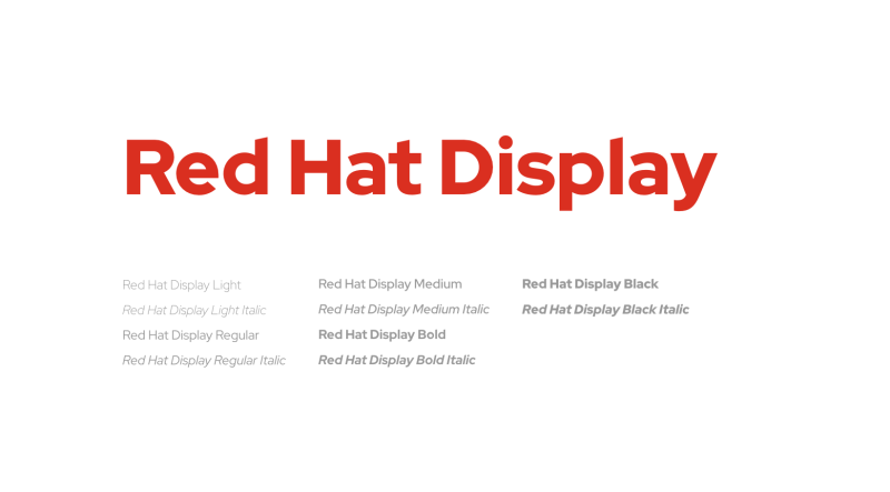
Introducing Red Hat, a stunning family of typefaces that captures the essence of geometric sans serifs. Commissioned by Paula Scher and Pentagram, and expertly crafted by designer Jeremy Mickel of MCKL, these fonts are the perfect choice for the modern, sophisticated brand.
Red Hat offers a unique blend of vintage and contemporary design, drawing inspiration from iconic American sans serifs such as Tempo and Highway Gothic. The Display styles boast low contrast and tight spacing, with a large x-height and open counters, making them ideal for bold headlines and striking graphics. The Text styles, on the other hand, feature a slightly smaller x-height and narrower width for improved legibility, with generous spacing and thinned joins for optimal performance at small sizes. The two families work seamlessly together, making Red Hat a versatile choice for any project.
25. Lufga
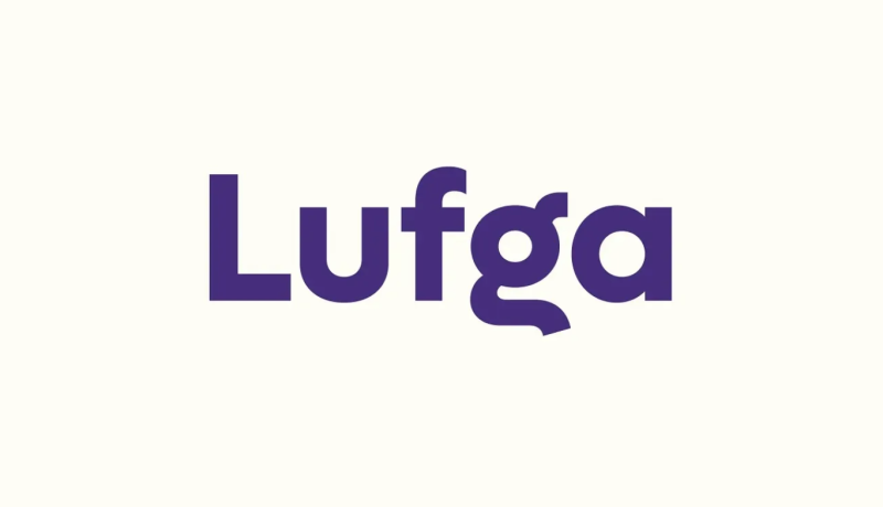
The Lufga Sans Font is a geometric sans-serif typeface with distinct characters. It boasts a clean and modern look while retaining a hint of retro tones. The lowercase g and u make it easily recognizable, and it also includes stylistic alternates for added variety. Suitable for a wide range of uses, including branding, advertising, packaging, headlines, magazines, websites, and logo design, Lufga's minimal design, low contrast, large x-height, and thin to black weights (with italics) make it a versatile choice for both text and display purposes.
26. Ubuntu
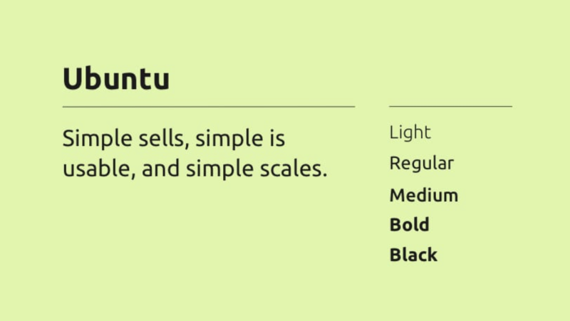
The Ubuntu Font Family is a collection of open-source, libre fonts developed between 2010-2011. The project is financially supported by Canoncial Ltd for the benefit of the Free Software community and the Ubuntu project. The technical design and implementation is done by Dalton Maag. The Truetype/OpenType files, as well as the design files, are distributed under an open license, and users are encouraged to modify, share, and improve upon them. The goal of the Ubuntu Font Family is to reflect the personality of Ubuntu in every aspect of the user interface, including menus, buttons, and dialogs. The typeface is a sans-serif design, with OpenType features and manual hinting for clarity on both desktop and mobile screens. The Ubuntu Font Family is also intended to be inclusive of all languages spoken by Ubuntu users worldwide, in alignment with Ubuntu's philosophy of accessibility and inclusivity. So the Ubuntu Font Family project will be expanded to cover more languages.
27. Kanit
The Kanit font family is a formal Loopless Thai and Sans Latin design that takes its name from the Thai word for mathematics. It combines elements of Humanist Sans Serif and Capsulated Geometric styles, making it versatile for both contemporary and futuristic uses. One unique feature of Kanit is the use of flat angle stroke terminals, which allows for decreased spacing between letters while maintaining readability and legibility at smaller point sizes.
28. Gilmer
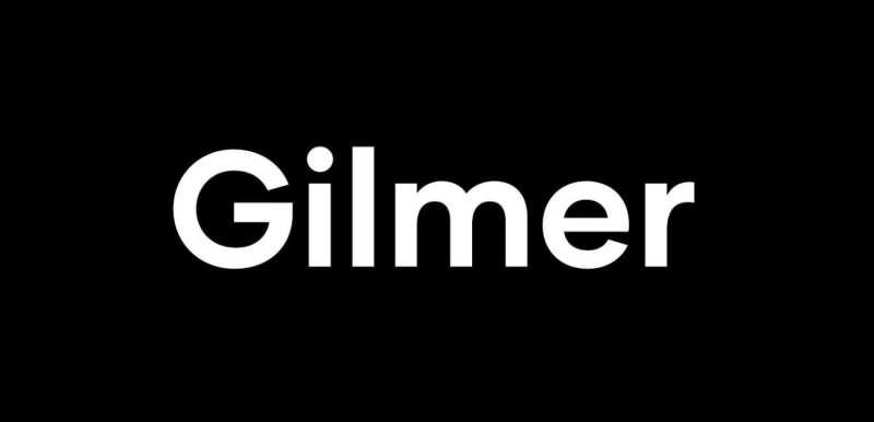
The Gilmer font family is a modern, geometric sans-serif typeface inspired by iconic designs such as Futura and Avant Garde. It features a large x-height, geometric letterforms, sharp edges, and minimal stroke contrast, similar to neo-grotesk fonts from the 20th century. The typeface is versatile and can be used effectively in various mediums such as magazines, posters, branding, and websites.
29. Nexa
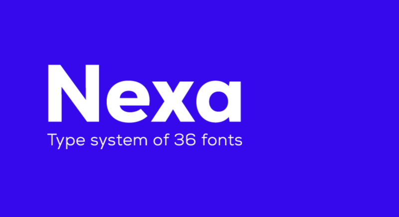
The Nexa font family is versatile and can be used for headings of all sizes and text blocks, whether they are large or small. The font styles are suitable for a variety of graphic design projects, including digital and web design, print materials, hard surfaces, fabrics, as well as posters, logos, and branding.
30. SF Pro Display
SF Pro is considered one of the best fonts for apps, as it is a neutral and flexible sans-serif typeface that serves as the system font for multiple Apple platforms including iOS, iPadOS, macOS, and tvOS. This font family offers a wide range of options, including nine different weights, variable optical sizes for optimal legibility, four widths, and a rounded variant. In addition to its versatility in design, SF Pro also supports a wide range of languages including over 150 languages across Latin, Greek, and Cyrillic scripts. This makes it a suitable choice for a wide range of design projects and audiences, and its use as a system font on Apple platforms further adds to its versatility and accessibility.
Things To Consider Before Using Free Fonts for Apps
Before you use a free font, you should make sure it's kosher to do so. If the font was released under a Creative Commons license, then there's a chance that the designer does not want you to use it for commercial purposes. Be sure to read the terms of use carefully before using any of these fonts in your projects.
Also consider whether or not there are restrictions on who can use the font and how they might properly credit the designer when doing so (i.e., what attribution language is required). A lot of times, if you want to be extra courteous, you'll want to make sure that people know where they came from by including attribution information such as "Designed by [name]."
How do I know if my downloaded font is legal?
Check the license. There are a number of different licenses, but a quick way to tell if you can use the font is to see if there’s any kind of restrictions in its license. If not, then it is okay for you to use it.
Check for the copyright symbol. The font should include a copyright notice on its packaging and/or within its name. This means that the creator has reserved all rights over their creation, which includes selling it and making changes without permission from others who have bought or downloaded their product.
Ask creators directly if unsure about usage limitations—they may be happy to explain how they want people using their work!
How to organise fonts?
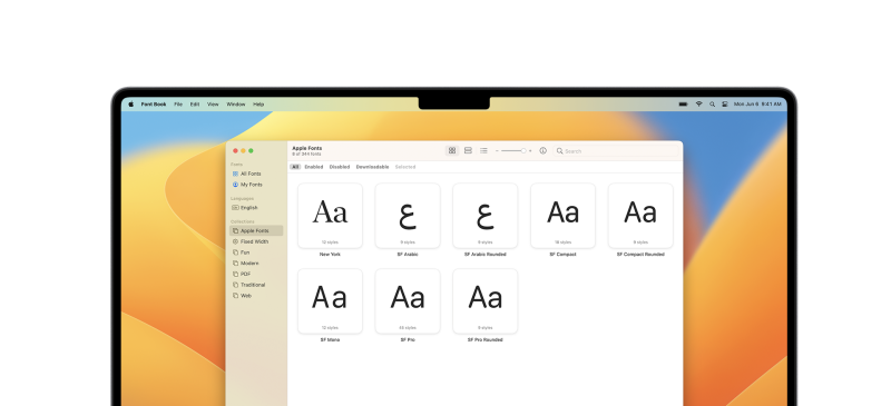
There are several ways to organise your fonts. The first one is FontBook on macOS, which allows you to preview and manage all of your installed fonts. It gives you the ability to group fonts according to their characteristics, such as typefaces from the same designer or styles similar in appearance.
Another option is Typeface for Mac, a free utility that groups fonts by classification (serif vs sans-serif) and also allows for visual organization based on design principles like heavy vs light weights, condensed vs extended widths etc.
If you want something simpler than these options then there’s Eagle, which is based on the idea that it should be easy enough for anyone with basic computer skills to manage their own collection of typefaces without having any experience or knowledge about typography whatsoever.
Conclusion
In conclusion, typefaces are a necessary part of modern design. They are the building blocks of words and letters that convey meaning through their appearance rather than their content alone. A good selection of fonts will help you create a more cohesive look on your website or app by using different styles and weights within one document or screen. The fonts featured in this article offer a wide range of styles and can work well together if used correctly.
What you should do now
Try our Figma mockups plugin for free and join over 195K designers like you using it to impress clients and speed up their workflow.
And if you’re already with us, here are more UI/UX tips to give you the edge:
")