The Triple-U Problem: A Rebrand Story
- Behind the Scenes,
- 7 minutes to read
A rebrand is more than a logo. It's infrastructure. It's a system that can grow with your ambitions. After years of trying to fix our brand ourselves, we finally did it right. Here's what we learned.
2014. We needed a domain for a side project. The obvious choices were taken. We'd seen how other platforms handled this: Flickr dropped vowels, Dribbble tripled letters, everyone found workarounds.
We added letters instead of removing them. Mockuuups. Three U's where one should be.
It was nothing serious at the time. A fun side project between other work. We registered the domain, built the first version (free PSD mockups back then), kept going.
The confusion started immediately. People misspelled it. Two U's, four U's, every combination. We bought mockuuuups.com and other variations to catch the traffic.
Checking the stats recently? Over 1,300 people hit those redirects last year.
Those three U's became a challenge we didn't know how to face. What worked for a hobby felt uncertain as the business grew.
Searching, Not Iterating
Over the years, we tried a few different directions. Nothing dramatic, but nothing that stuck either.
We wanted consistency and long-term focus. That's our style, how we approach product development. But we never built a system that could last in both our communication and product. Something always felt off.
Each attempt was trying to solve the wrong problem.

The real issue? Support tickets kept requesting print mockups. Posters. Billboards. T-shirts. Mugs. Natural growth for a mockup platform. We had the photography skills, the infrastructure, everything needed to expand.
Except a brand identity that could stretch beyond devices.
We were device-only. Our mockup generator covered phones, tablets, laptops, watches. Everything built around screens. Print didn't fit.
Sometimes you're too close to the canvas to see the composition. As designers, we know this. We tell clients this. But applying it to your own work? Harder than it sounds.
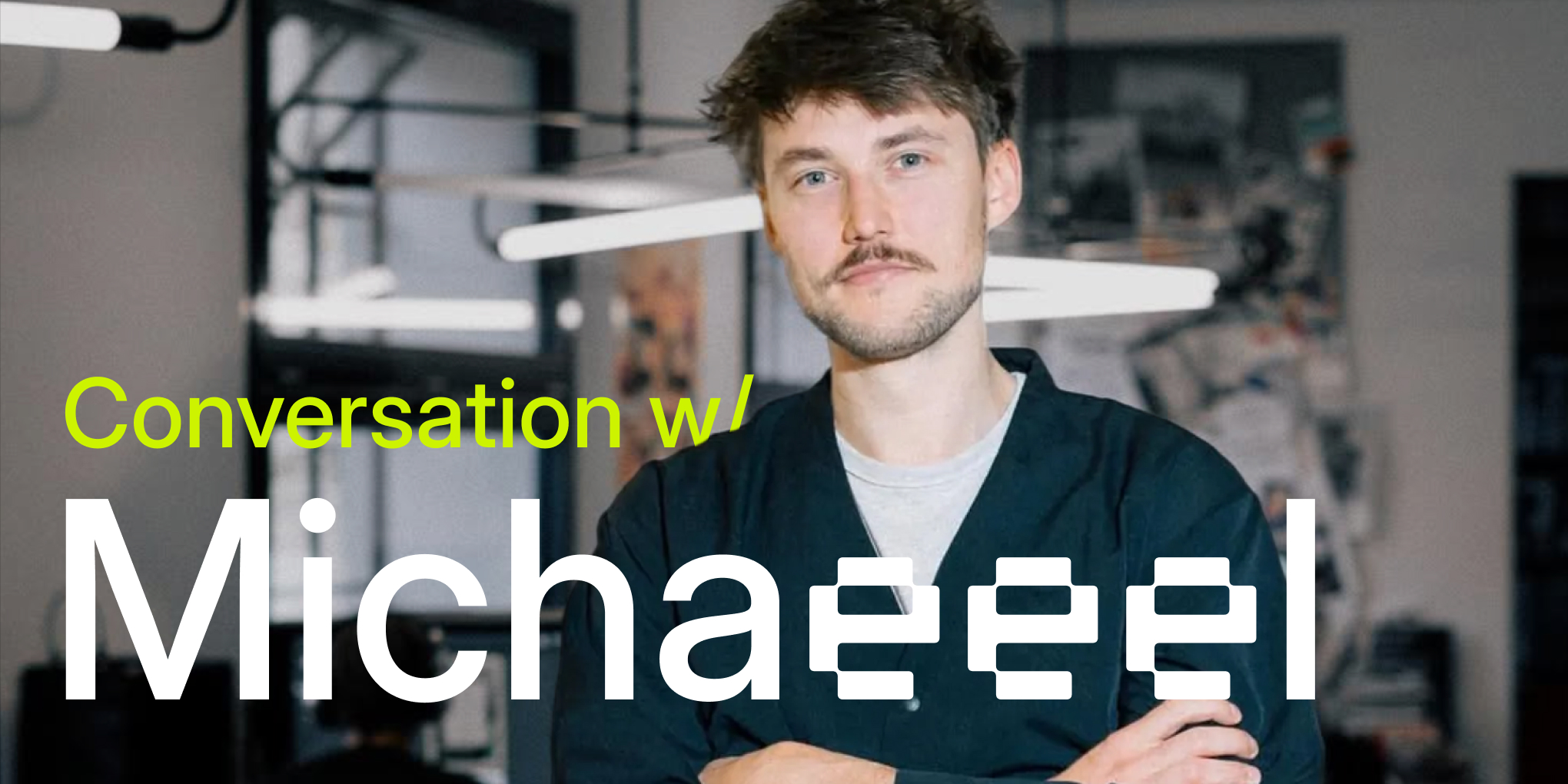
Decision: bring in an external partner. Not to execute our vision, but to explore with us. To see what we couldn't. To work through it together with fresh perspective.
We partnered with Studio Najbrt, led by designer Michael Dolejš. The collaboration became about more than just visuals. It was about building a system that could grow. Read our conversation with Michael about the creative process.
Building a System, Not Just Visuals
We needed more than new visuals. We needed a system.
Like any good design project, clarity at the start determines everything. A vague brief leads to endless revisions, while a clear one creates focus.
We spent time articulating exactly what had to change and why. Not surface-level aesthetics, but the fundamental infrastructure. This clarity became the foundation for everything that followed.
Three Core Challenges
- Typography that functions as brand language.
- Placeholder system - the blank screens and surfaces in our mockups where designers insert their work - that could adapt from device displays to print materials like poster mockups and t-shirts.
- Visual identity that could stay easy to maintain and consistent long-term.
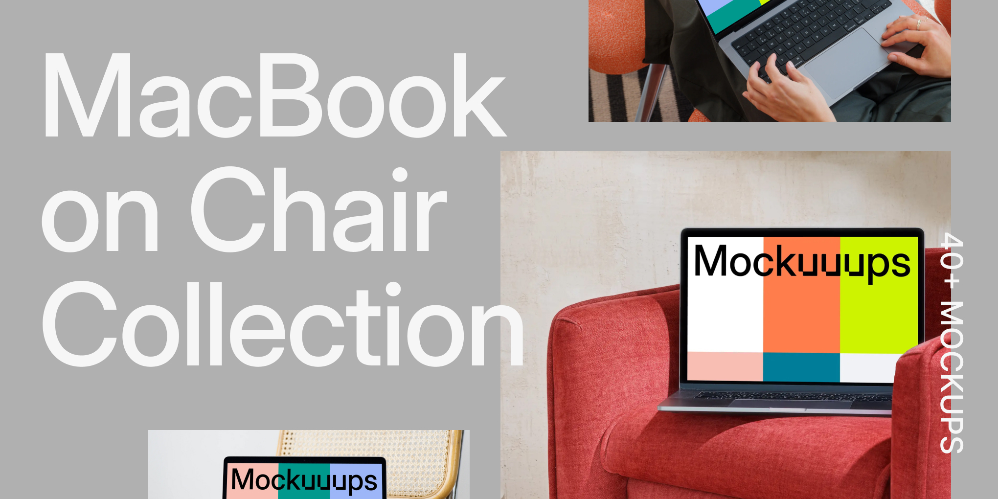
The Triple-U Solution
Instead of hiding the UUU or treating it like a compromise, what if we made it the system?
For years, we'd been running from those three U's. Trying to downplay them, work around them, make people forget they were there. But the exploration kept circling back to the same insight: what if the thing we saw as a liability was actually distinctive?
The idea was to apply the triple-vowel pattern systematically across everything. Mockuuups → T-shiiirt → Compuuuter
Our immediate reaction? "Maybe too much triples?" But connecting the dots, collecting all the pieces... it made sense.
Suddenly the domain hack had a story. The confusion about spelling became memorable. The quirk became a feature. Most importantly, it gave us ownable language that no competitor could replicate.
Inteeer: Typography as System

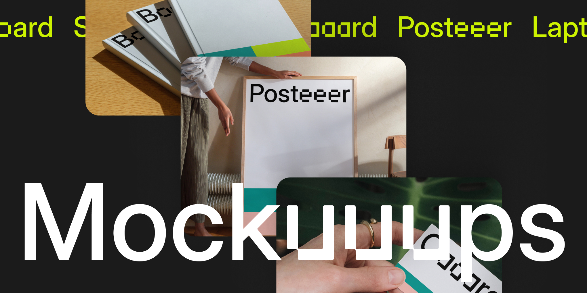
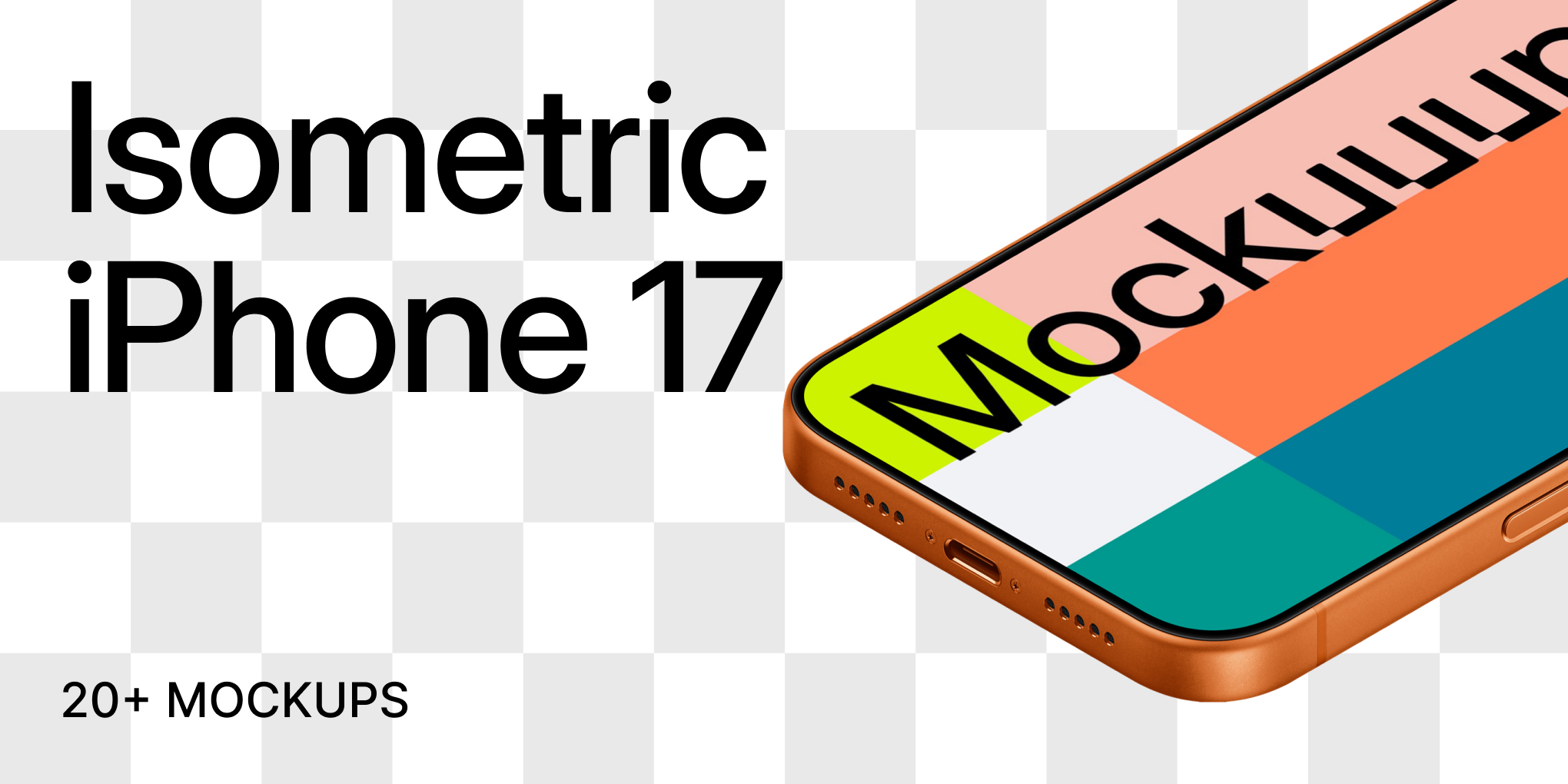
We developed a modified typeface where vowels get the pixelated treatment. We decided to customize Inter font by Rasmus Andersson (open-source and beautifully crafted), modifying all the vowels to match the triple-U pattern. When you see "Mockuuups" or "Posteeer," the repeated vowels share the same pixelated style.
But this created a problem.
Technical challenge: SEO. We can't have search engines indexing "Compuuuter" and "Tableeet" everywhere. Search engines need to understand we're talking about computers and tablets, not gibberish.
The solution: stylistic sets. The underlying HTML stays clean for search engines: "computer," "tablet," "poster." But through OpenType features, those words render with pixelated vowels for anyone viewing the site.
Regular text for crawlers. Inteeer for everyone else. The UUU went from liability to distinctive brand language. And the typeface made it systematic.
The Lost Signal Metaphor
Remember TV test patterns? Those color bars broadcasters would show before programming started, or when there was a signal interruption. Calibration stripes saying: content will appear here, but this space is waiting.
For mockups, that metaphor is perfect. The scene is empty until you fill it with your design.
We built a system using abstract signal stripes + acid green + 4 supporting colors. While competitors went beige and minimal, we went distinctive.
The result: Limitless variants that work across any mockup type, any aspect ratio. The typography system integrates directly into placeholders, describing what you're looking at while maintaining visual consistency.
Device or print. iPhone or billboard. Always recognizable as Mockuuups.
From Slides to Reality
Presentations don't matter if it doesn't work in the real world. We started our iterative rollout in mid-2024, testing pieces gradually rather than launching everything at once.
Taking Space in Search Results
First test: Pinterest communication using the new signal placeholders. We even wrote a simple guide how to automate Pinterest content to help scale distribution.
The proof came quickly. Search Pinterest for "macbook mockup" — 6 out of 15 top results are ours, and you can spot them instantly. The acid green, the signal pattern, the visual language cuts through the noise.
Small Details Matter
On the web, we added subtle micro-interactions to the logotype. Hover states. Small movements. Nothing dramatic, but it reinforces the playful side of the brand.
Most people won't consciously notice them. But that's the point. They register as a feeling more than a feature. The site feels more alive, more crafted, more intentional. The kind of polish that's felt rather than seen.
Ownable Language
The triple-vowel system extends throughout the interface. Our category dropdown uses the naming convention consistently: Compuuuters, Laptooops, Tableeets.
Subtle enough to feel natural, distinctive enough to be ours.
Gradual Improvement
We didn't create a polished case study or time a big announcement. For us, the brand keeps evolving. For those curious about how it came together, here's what changed over months:
- Placeholder generation: early versions produced awkward color pairings. We adjusted the logic until combinations felt intentional.
- Motion design: came a year later. Started with pattern animations, expanded into typography, video, interface transitions.
- Small team benefit: notice something off, fix it that day. No committees, no approval chains.
Being self-funded meant treating this as a process, not a launch. Test quietly. Refine what doesn't work. Keep moving. The system grows with the product.
A System That Grows
We didn't just change how we look. We built a system that supports our approach: long-term, consistent, product-focused.
Remember those support tickets asking for print mockups? The ones we couldn't fulfill because our brand was built for devices only? They're live now. Business card mockups, poster mockups, paper mockups, book mockups and more coming soon.
The challenge we couldn't face alone? We brought in fresh eyes, removed ourselves from the problem, and built something that can finally grow with us.
This isn't finished. The brand evolves as we do. But for the first time in years, we have infrastructure that can hold our ambitions. Print categories today, whatever comes next tomorrow.
If you've read this far, we're lucky to have you on board. Every. Single. One of you.
Reach out anytime. We're open to hearing your thoughts, feedback, questions. Building in public means staying connected with the people using what we make.
Thank you for supporting a small business doing what we love: creating the best possible mockup experience for the design community.
We can't wait to show you what we build next.
David & Marek
What's Mockuuups Studio?


 floating to the left")


