Portfolio Landing Page Inspirations to Explore This August
- Inspiration,
- 9 minutes to read
Explore inspiring portfolio landing pages in August. Discover effective design examples that seamlessly blend aesthetics with functionality, while enhancing user experience. These curated selections showcase how intentional layouts and messaging can create a memorable online presence for designers and businesses alike. Dive in for practical insights and ideas.
A well-designed landing page can make or break your online presence. It's the first impression you make on potential clients or customers, and it's crucial to get it right. In this article, we'll explore some inspiring portfolio landing page examples that showcase effective design, user experience, and conversion optimization techniques. Whether you're a UI/UX designer looking to revamp your portfolio landing page or a business owner seeking inspiration for your website, these examples will provide valuable insights and actionable ideas to create a standout online presence.
August's Portfolio Landing Page Inspirations: Designs That Convert
Ready to elevate your portfolio landing page design? Look no further! This curated list showcases some of the most impressive and effective landing pages we've come across. From sleek minimalism to bold creativity, these examples demonstrate how to balance aesthetics with functionality. As you browse through these portfolio landing page examples, pay attention to the clever use of color, typography, and layout. Each page offers unique insights into conversion optimization and user experience design that you can apply to your own projects.
1. Lowe's Innovation Labs
Lowe's Innovation Labs nails it with their sleek landing page. It's all about the future of home improvement, and you can feel it from the get-go. The color scheme? On point. Typography? Clean and consistent. What really stands out is how well everything flows - from the intuitive navigation to the clear labeling. Content-wise, they've struck a perfect balance between being informative and persuasive. It's like they're saying, "Hey, come check out what we're cooking up!" without being pushy. If you're into seeing how big brands are pushing the envelope in home improvement tech, this page is definitely worth a look.
2. Jean-Christophe Suzanne
Clean and sleek, this landing page nails the minimalist vibe. The black-and-white palette keeps things pro without being boring. Big, bold typography makes sure you don't miss a thing. I love how the layout guides your eyes naturally, and the menu? Crystal clear. It's like the page is saying, "Hey, come check this out!" without shouting. Definitely a page that makes you want to explore more.
3. Digital Flagship
Digital Flagship's landing page is a masterclass in user-centric design. The harmonious color palette and bold typography create an inviting atmosphere while enhancing readability. I'm impressed by how the well-structured layout naturally guides the eye, making navigation a breeze. Clear messaging effectively communicates the brand's mission, leaving no room for confusion. It's evident that every element has been carefully crafted to create a professional and engaging digital experience. This page sets a high bar for what a modern, bold brand's online presence should look like.
4. Nero Némésis
Nero Némésis nails it with their landing page. The color scheme is on point, mixing cool and warm tones that scream professionalism and creativity. Typography? Clean and easy to read. You won't be squinting here. The layout is a breeze to navigate, with clear labels that make sense. Plus, the messaging hits hard, making you want to dive deeper. It's a visual treat that draws you in from the get-go. If you're looking for inspiration on how to make a killer first impression, this is it.
5. Studio Giancarlo Valle
Studio Giancarlo Valle's landing page is a masterclass in harmonious design. The warm, sophisticated color palette instantly captivates visitors, while the elegant typography ensures readability without sacrificing style. The well-organized layout naturally guides the eye through visually appealing content, making exploration a breeze. With intuitive navigation and clearly labeled menu items, users can effortlessly find what they're looking for. This inviting design strikes the perfect balance between aesthetics and functionality, encouraging visitors to dive deeper into the studio's work.
6. Black Jays Ventures
Black Jays Ventures nails their landing page with a sleek, modern design that instantly grabs attention. The color palette is on point, blending calming neutrals with pops of orange that guide the eye. Typography? Clean and crisp, making it a breeze to read. I love how the layout naturally flows, leading visitors through the content without feeling forced. They've nailed the messaging too, clearly communicating what they're about without overwhelming you. It's the kind of page that makes you want to stick around and learn more.
7. Wordstone
Wordstone's landing page nails the professional vibe with its sleek color palette and crisp typography. The layout is a breeze to navigate, guiding visitors smoothly through the content. What really stands out is how they've balanced the formal nature of their services with an inviting design that doesn't feel stuffy. It's clear, persuasive, and encourages you to dig deeper into what they offer. A solid example of how to present complex services in an approachable way.
8. Studio Sentempo
Studio Sentempo's landing page is a masterclass in visual storytelling. The harmonious color palette and clean typography create an inviting atmosphere that draws you in. As you scroll, well-organized sections showcase vibrant project examples, effortlessly guiding your eye through their impressive portfolio. The intuitive navigation and clear messaging make exploring a breeze, encouraging visitors to dive deeper into their work. It's a perfect balance of style and functionality that leaves a lasting impression.
9. Mammamia Studio
Mammamia Studio's landing page is a masterclass in user-friendly design. The warm color palette instantly builds trust, while the clear typography ensures every message hits home. I love how the well-structured layout naturally guides my eyes, making navigation a breeze. Their persuasive messaging is on point, clearly communicating their value without overwhelming me. From the moment I land on the page, I'm drawn in and eager to explore more. It's a perfect example of how a thoughtful design can create an inviting digital space that encourages engagement.
10. Sophia Amoruso
Sophia Amoruso's landing page nails the balance between sleek and welcoming. The color scheme is on point, giving off both a pro and friendly vibe. Fonts? Easy on the eyes and consistent throughout. The layout's a breeze to follow, naturally guiding you through the content. Navigation's a cinch with clear labels, making the whole experience smooth sailing. What really stands out is how the page pulls you in, making you want to dig deeper with its persuasive messaging. It's like the digital equivalent of a firm handshake and a warm smile - professional, but with personality.
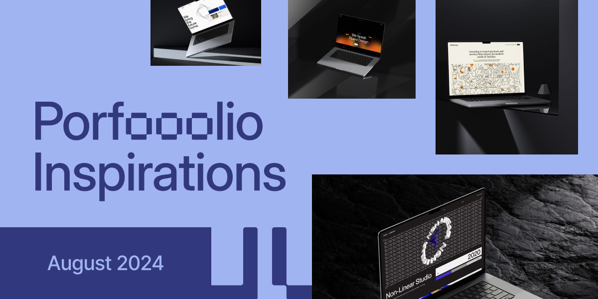
11. Non-Linear Studio
Non-Linear Studio's landing page is a masterclass in modern design. The bold color scheme, blending blues and grays, creates an inviting yet professional atmosphere. Clear typography enhances readability, while the intuitive layout guides visitors effortlessly. Concise messaging reinforces their creative expertise, striking a perfect balance between professionalism and innovation. This page showcases how thoughtful design can effectively communicate a brand's essence, making it a standout inspiration for UI/UX designers aiming to create impactful landing pages.
12. Cohere
Cohere's landing page is a masterclass in brand consistency. The color palette is spot-on, creating a cohesive look that's easy on the eyes. Typography? On point. You can read everything without squinting or zooming. The layout is clean and organized, guiding you through their work effortlessly. Navigation is a breeze, and the messaging is crystal clear. It's like they're saying, Hey, come check us out! without being pushy. This page makes you want to explore more of what Cohere has to offer in hospitality and real estate branding.
13. NutsDev
NutsDev's landing page is a masterclass in visual harmony. The color palette is a feast for the eyes, striking the perfect balance between vibrant and professional. Typography is on point, making content a breeze to read. The layout? It's like a well-choreographed dance, leading visitors effortlessly through the page. Navigation is a cinch, and the messaging hits home without trying too hard. It's the kind of page that makes you want to stick around and see what else NutsDev has up its sleeve.
Key Takeaways
After exploring these inspiring portfolio landing page examples, it's clear that effective design goes beyond aesthetics. Here are some key takeaways:
- Consistency is key: A cohesive color scheme and typography across the page create a professional look and enhance brand identity.
- User-centric design: Intuitive navigation and clear messaging guide visitors effortlessly through the content, improving user experience.
- Balance aesthetics and functionality: Striking the right balance between visually appealing design and practical usability is crucial for conversion optimization.
- Showcase your work: Effectively presenting your portfolio or services can make a lasting impression on potential clients.
- Persuasive messaging: Clear, concise, and compelling content can encourage visitors to take action and explore further.
Remember, your portfolio landing page is often the first point of contact with potential clients. By implementing these best practices and drawing inspiration from these examples, you can create a landing page that not only looks great but also effectively communicates your value and converts visitors into clients.
Further Reading
If you're looking to dive deeper into UI/UX design and improve your skills, check out our article on How to Improve UI/UX Skills. This comprehensive guide offers practical tips and strategies to enhance your design capabilities, from mastering design tools to understanding user psychology. For those interested in exploring innovative design trends, our piece on Best Bento Grid Design Examples showcases how this popular layout style can be used to create visually stunning and highly functional interfaces. These resources will provide valuable insights to help you stay ahead in the ever-evolving field of UI/UX design and create more effective portfolio landing pages.
What's Mockuuups Studio?