UX (or "User eXperience") is the process of enhancing customer satisfaction and loyalty by improving the usability and ease of use in the interaction between the customer and the product.
UI (or "User Interface") is the look and feel, the presentation and interactivity of a product.
Some designers feel that UX is more important because it helps users to feel at-ease interacting with a website or an application. On the other side, some designers feel that UI is the "true face" of the product and that it attracts more customers.
I believe that UX is more important than UI.
Let’s start with examples of good and bad UX designs:
Example: Apple.com
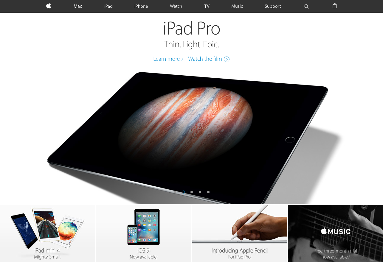
At Apple, UX prevails. This begins with the great navigation at the top of the page. The header is clear and there are only a few options. It’s really easy to choose your next step. If you somehow are lost, there is search option on the right. You always know where you are.
Below the header, there is strong, clear high-quality headline picture of the featured Apple product. Below the image, there are only a few smaller pictures and links to latest news. Even going to the bottom footer, there are links to just the information you need: contact info, store location and a link to details about the company. And that’s all! The landing page so clear that you will find what you are looking for in less than a minute.
“UI without UX is like a painter slapping paint onto the canvas without thought; while UX without UI is like the frame of a sculpture with no paper mache on it.”
Now let’s take a look at a different UX example.
Example: Ryanair.com
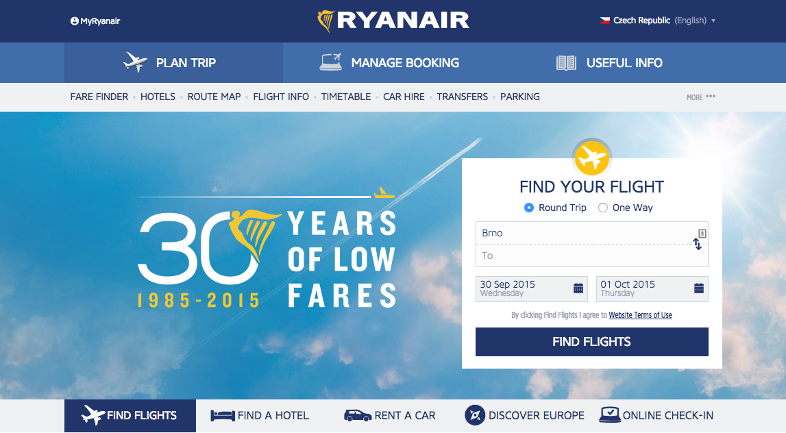
At Ryanair, UX prevails. It starts with three different navigations at the top of the page. The header is overladen with information and there are more than 10 options to choose. I guess you’re lost already. You came to airlines company website, but there is too much unnecessary information: car hire, hotels or business plus. Our priority is to find flight tickets, not to rent a car.
Below the header, there is triple, overladen headline pictures with best flight deals and offers for 2015 years. Find your flight option in the headline picture is the only useful option yet. Below the images, there is another line of options like on the top of the website. Then coming Cheap flights with 16 featured flight destinations. It really too much! And after all this madness they decided to share the information about inspiration and weather forecast from other countries. Not talking about the footer which probably have more information than other websites in the whole landing page. Summary is really clear: too much information and really bad navigation.
How to avoid these design mistakes:
- You need to know your audience, what type of people going to the website. Students, entrepreneurs or even young families.
- Clear flow scenario. Every step of your customers will do. You need to find the easiest way for you users to reach the objective.
- Use only a few features. 3 - 4 features is enough. More features you will offer the harder it will be to choose.
- And the main point is to classify your information. Only the most important information should be on the landing page. Secondary information should be placed in other categories.
It is only two examples of thousands of great and bad UX designs. Maybe next time I will show you websites which created harmony between UX and UI designs.
In conclusion I think the first step to successfully attacking any problem is to understand what is more important for you and what goals you have. Understanding the difference between UI and UX is an intellectual asset with staggering ramifications. When you will understand this point, you will realize how important UX and UI are.

